01 — Introduction
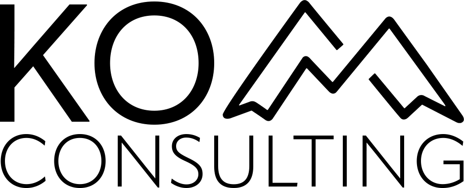
A lockup that reads as KOM
The primary logo is a two-line lockup: KO plus a mountain symbol that stands in for M, with CONSULTING set underneath in a single tracked line. The mountain is not decoration. It completes the name.
Use only the supplied PNG masters. Do not redraw, retype, or recreate the artwork. Colour in this document comes from the Figma colour system. Type is Inter, Regular, SemiBold, and Bold.
02 — The logo
Primary lockup
This is the default identity for websites, documents, presentations, and signage. Prefer it over the isolated mountain whenever there is room to show the full name.
Two masters exist: black for light surfaces, white for dark surfaces. Do not recolour the lockup with brand blues or oranges.

03 — Construction
Anatomy
Keep the relationship between wordmark, symbol, and descriptor fixed. Never restack, reverse, or separate the parts to invent a new logo.
- KO wordmark
- Geometric sans letters. Optical cap-height aligns with the mountain peaks.
- Mountain symbol
- Two-peak outline that reads as M. This is the only approved standalone mark and the favicon.
- Descriptor
- CONSULTING sits on a second line, full width of the lockup, lighter stroke, wide tracking.
- Master files
KOM-Consulting-logo-black.pngandKOM-Consulting-logo-white.png— 2000×2000 transparent PNG.
04 — Clear space
Give the mark room
Clear space is measured as x, equal to the height of the mountain symbol. Keep at least 1x of empty space on every side. No type, photography, or UI controls may enter this zone.
When in doubt, add more space rather than less. Tight headers still need a minimum of 0.5x if 1x is impossible; treat that as an exception, not the default.
05 — Minimum size
Stay legible
Below these sizes the descriptor and mountain stroke collapse. If the lockup cannot hold the minimum, use the mountain symbol alone.
Digital lockup
Min. width 120px
Print lockup
Min. width 25 mm
Symbol only
Min. 16px / 5 mm
06 — Colour versions
Approved backgrounds
The lockup is one-colour only: black or white. Place it on the surfaces below. Photography is allowed only when contrast is strong and the clear space is unobstructed.
07 — The symbol
Mountain mark
The mountain is the compact identity. Use it when the full lockup cannot fit: favicons, social avatars, app icons, map pins, and repeating small UI. It must not replace the lockup on primary marketing pages or letterheads.
Master file: KOM-Consulting-mountain.png (845×430, transparent).
08 — Favicon
Browser and home screen
The favicon is the mountain asset, not the full lockup. Browsers use the transparent black mark. iOS and Android home screens use the white mark on Primary Minus 500.
 16×16
 32×32
 48×48
180×180 app
 192×192
09 — Incorrect use
Do not alter the artwork
These treatments break recognition or contrast. If a layout needs something the lockup cannot do, use type and colour from the system instead of modifying the logo.
Do not stretch or squash.
Do not rotate or skew.
Do not recolour the lockup.
Do not add shadows or effects.
Do not place on low contrast.
Do not crop the lockup.
Do not outline or frame the mark.
Do not overlap type or imagery.
10 — Colour system
From the Figma foundations
Ramps follow the Figma colour system: Primary Plus / Minus, Secondary Orange Plus / Minus, and Neutral Grey, Dark, and White. Table Colours are the working set for UI and documents. The logo itself stays black or white.
Table colours
#269AD0Plus 500#095DA2Minus 500#E3863DOrange+ 500#E05E28Orange− 500#8C8C8CGrey 500#111111Dark 500#FFFFFFWhitePrimary Plus
#E6F6F750#BCE1EE100#99D5ED200#69BFE9300#4FB0DD400#269AD0500#208EBD600#216E93700#0D556F800#114652900Primary Minus
#E7EEF450#B2CEE3100#8EB6DA200#5A92C4300#3B7DB0400#095DA2500#0A588E600#0C4171700#0B345B800#06273E900Secondary Orange Plus
#FCF4EC50#F6D8C0100#F7C7AB200#F3AA75300#EA9C5E400#E3863D500#CD7B36600#A75E27700#7B4B27800#5B391E900Secondary Orange Minus
#FDF0E750#FCCDB5100#F2B399200#F19276300#E77F53400#E05E28500#C65522600#9E4215700#7B351E800#632B18900Neutral Grey
#F5F5F550#DBDBDB100#C8C8C8200#B1B1B1300#A1A1A1400#8C8C8C500#7E7E7E600#646464700#4B4B4B800#3D3D3D900Neutral Dark
#EAEAEA50#B6B6B6100#939393200#5E5E5E300#464646400#111111500#0F0F0F600#0A0A0A700#0A0A0A800#090909900Contrast
| Pair | Use | Ratio | Level |
|---|---|---|---|
| Dark 500 on White | Body copy, logo on light | 18.1:1 | AAA |
| White on Minus 500 | Buttons, header bars, app icon | 6.8:1 | AA |
| Minus 500 on White | Links, charts | 6.8:1 | AA |
| Orange− 500 on White | Labels and large type only | 3.6:1 | AA large |
| White on Dark 500 | Logo reverse, dark UI | 18.1:1 | AAA |
11 — Typography
Inter
The Figma type system is Inter in Regular, SemiBold, and Bold. Do not substitute Arial, Helvetica, or another geometric sans in brand materials. On the web, load 400, 600, and 700.
KOM Consulting
56 / 62 · SemiBoldThe mountain completes the name
40 / 48 · SemiBoldLogo guidelines
32 / 40 · SemiBoldPrimary lockup
24 / 32 · SemiBoldApproved backgrounds
20 / 28 · SemiBoldTable colours
18 / 24 · SemiBoldUse only the supplied masters. Do not redraw the artwork.
18 / 28 · RegularClear space is measured from the mountain symbol height.
16 / 24 · RegularMinimum lockup width is 120px on screen and 25mm in print.
14 / 20 · RegularPrimary minus 500
12 / 16 · SemiBold12 — Placement
Where it sits
On websites, pin the lockup top-left. On documents, top-left or a centred cover is acceptable. Partnership lockups sit side by side with a 1px Dark 500 divider and equal optical weight — never stacked into a combined mark.
13 — Export sizes
Ready-made widths
Use these files from Assets/sizes. Scale down from a larger file if you need an in-between width. Never scale a small file up.
Logo 160px
Logo 320px
Logo 640px
 32
 64
 128
 192
 Website preview
14 — File formats
What to use when
PNG masters are the source of truth until SVG artwork is produced. Do not screenshot this page for production use.
Do
- Use the lockup at or above minimum size
- Keep 1x clear space
- Switch black/white for contrast
- Use the mountain for favicons only
Don’t
- Recreate or retype the logo
- Apply brand orange or blue to the lockup
- Add slogans inside the artwork
- Use a low-resolution screenshot